

the shameless joy of the thesis selfie & those three little letters emblazoned in gold
Having books bound signifies respect for the book; it indicates that people not only love to read, but they view it an important occupation. ~ Fyodor Dostoyevsky, Demons
The chemical breakdown of the smell of books was the subject of a 2009 study (downloadable here and nicely summarised here), but those smells are about more than science. They are about emotions and memories. Libraries. Being read to snuggled in beds. Reading alone in beanbags, on sunny window ledges or in hidden cubbies or corners. Dragons and sleuths and science and fantasy. Escape into other worlds and other lives. Empathy, fear, disgust, happiness, tears. The pads of fingers on pages. The whoosh of the page turning. The thud of a closing book. The grief when a trilogy or series ends.
I’ve written before about the memories of my grandfather’s study, filled as it was with old books, including the two prized books he left to me. My grandfather wasn’t a Ron Burgundy kind of man, but he did have many leather bound books. He was an academic, a professor and a book binder. (He also made those little wooden ships and magically placed them inside bottles.) The smell of old books–which is described here by Deepak Mehta as bibliochor, inspired by the word petrichor–takes me back to sitting in the cushiony chair in that study, having books gingerly passed into my hands. Feeling their physical and symbolic weight. He didn’t live long enough to see me finish my PhD and share my own Big Book with him, but I was lucky enough to be able to share the first part of my PhD journey with him.
This week I was full of nerdy book-loving joy when I picked up the hard bound copies of my PhD thesis. I’m an English and Literature teacher, reader, bibliophagist, smeller of books, narrative researcher and writer of texts. So it stands to reason that I would be obsessively perfectionist about the physical thesis book (totally reasonable, right?). I agonised over font, paper and end papers.
What’s in a font? That which we write in Helvetica by any other font would read as sweetly.
I always envisaged my thesis volume as channelling the old storybooks and encyclopaedias (remember those?) of my childhood. My selection of the font Garamond acknowledges that serif fonts are more readable, while visually referencing the traditional old-style serif typefaces of literary fiction. Garamond is a sixteenth century French artisanal font based on the work of Claude Garamond, and it is lovely in italics. It was a more beautiful option that the conventional Times New Roman. Apparently TNR is mandated in some institutions but as its inception was to squeeze the most text into the columns of The Times, it’s a bit squishy and a bit ubiquitous.
If you are thinking about thesis fonts, check out Anitra Not’s wonderful Slideshare on how to make a beautiful thesis. There should be a word for ‘the joy brought by beautiful typeface’. I don’t think that thinking about the beauty and readability of your thesis is total phdcrastination; there’s some method in wanting to present your work in a way that resonates with its purpose.
O, feel of paper and smell of page!
While my university prints theses on heavier-than-usual copy paper, I ended up researching papers on which I might print the thesis. I eventually settled on an archival paper watermarked with the National Archives of Australia registered trademark. It was cream rather than white and a bit textural rather than super-smooth. I tested the paper for its ability to handle the illustrations in my thesis and printed double-sided, to keep the thickness down and save some paper, rather than for aesthetics (there was a bit of show-through).
I also bought some white Japanese Unryushi paper to act as endpapers after I discovered that getting marbled endpapers in Australia is prohibitively difficult (my granddad would have known where and how to get some).
thesis pages
Bound pages nestled within the regal carapace
To bind a doctoral dissertation is not just to join pages prosaically together into a document. There are medieval bookbinding traditions and regal colours. In Australia there isn’t really a choice in the actual binding as each university tends to have theses bound by a particular book binder, to particular specifications. The traditional binding is in buckram cloth with gold lettering. Each university has different colours associated with each degree. At my university, the PhD thesis is bound in maroon, so maroon it was. The nice thing about that was that on the day I picked up my pile of five theses (one for the university library, one for each supervisor, one for the school at which I conducted my study and one for me) people congratulated me as I walked through the grounds. “Well done!” “Congratulations!”

The Big Book
Of course, none of this matters in the big picture. A font does not make or break the substance of a thesis. A bound thesis needs to meet its university library’s specifications, but no more than that. I know that my thesis could have been printed in Arial or Times New Roman, on ordinary copy paper, and it would have been of the same written quality. Now that most theses will be read online, the archival quality of the thesis makes even less difference than in the past.
Yet, my own love of books and their tactile, olfactory and objet d’ art properties meant that I put a lot of cognitive and emotive energy into the physical book. And I took a lot of joy from experiencing the finished product. It might have been my favourite PhD moment so far. If you’re like me, go ahead and embrace your inner book nerd.
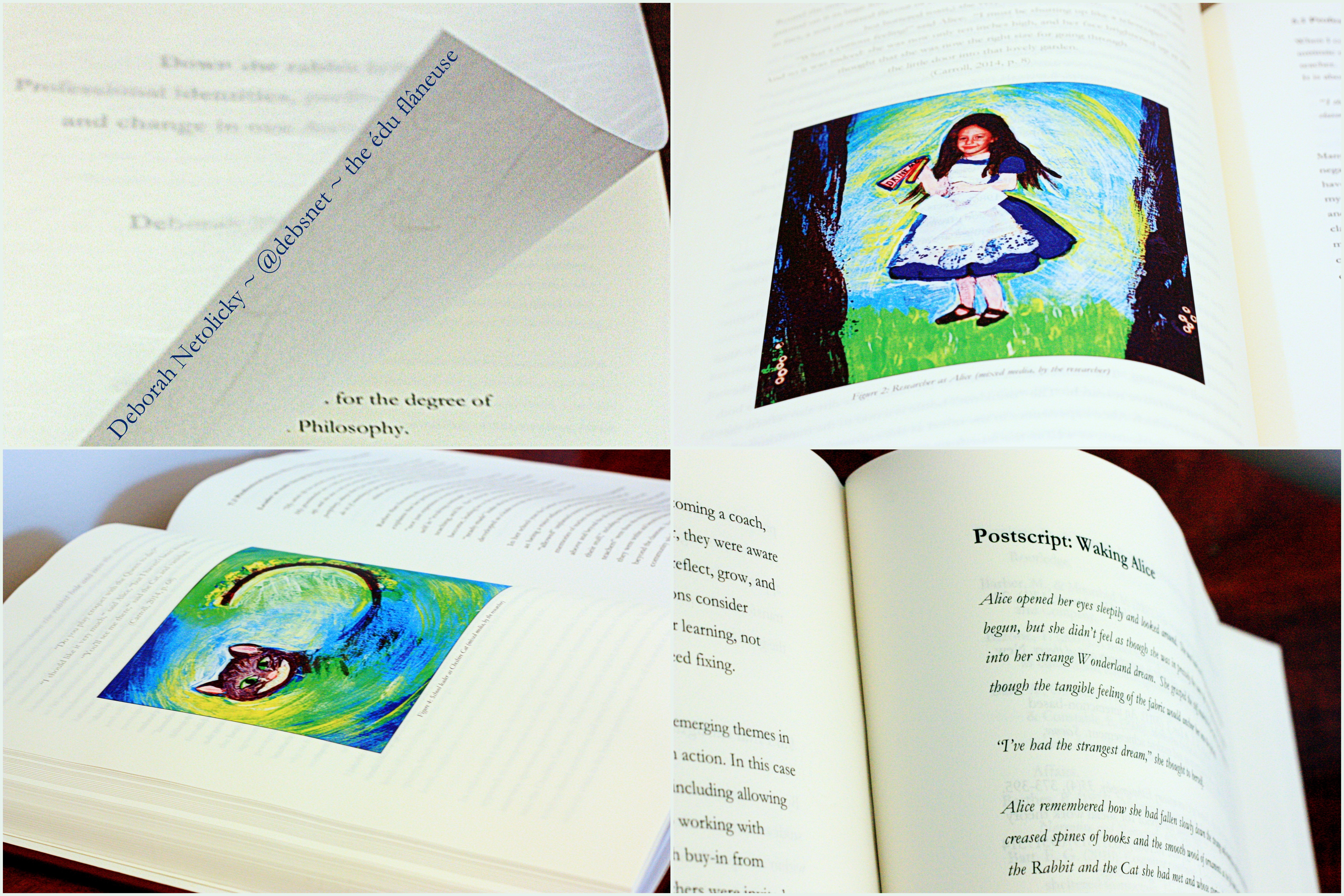
It’s ok to be a book-perfectionist. It’s ok to love your finished thesis, imperfect as it might be. Think of it as a handmade quilt, full of the humanness of your mark. For me the choice of font, slightly textural end papers and creamy archival paper were about valuing the text and helping my reader enter the narrative of my thesis, which uses Alice’s Adventures in Wonderland as a literary lens. The tactile experience of turning those first pages might help them down the rabbit hole of the text and into the world of story, into the study and back to their childhood memories of reading.

bookish gifts for my supervisors

OMG. I was given no such options in my thesis. Damn them all to hell. I chose Book Antiqua for the body of my text although I was ordered to use times for the frontispieces. My other font was the horrid Arial. Mandated to be the ugliest font in the world, but few choices were available. Online binding option. I chose 2 colours: a lovely silvery grey, and a royal blue for my 3 copies. 📘📚
LikeLike
I like Book Antiqua. It’s amazing what a tiny amount of choice (the font!) can do to our feelings of ownership. And it’s interesting that each university has its own quirky rules. I was dreaming of binding mine in the electric blue I’d seen, until I realised that was a Masters by research thesis at my uni, and I had to go with the mandated maroon (although I think for my own personal copy I could have chosen any colour).
Deb
LikeLiked by 1 person
Oh! And btw, you will use parts of your thesis in other articles for a long time. I’m doing so now!
LikeLike
Currently I can see plenty of potential for further writing, so that’s great to know.
LikeLiked by 1 person
Pingback: PhD: The gift that keeps on giving | the édu flâneuse
Pingback: The PhD graduation ceremony | the édu flâneuse
Pingback: Why selling a house is like finishing a doctorate | the édu flâneuse
Pingback: Flashback Friday: The end of the PhD | the édu flâneuse
Hi there very cool web site!! Man .. Excellent
.. Superb .. I’ll bookmark your blog and take the feeds also?
I’m glad to search out numerous useful information right here
within the publish, we need work out extra techniques
on this regard, thank you for sharing. . . . . .
LikeLike